Badge
A badge indicates the status of an entity and can evolve at any time.
Types
The badge component is available in 5 states. Each state corresponds with a defined status.
| Colour theme | Status | Preview |
|---|---|---|
| Information | New, To review, Draft | |
| Success | Validated, Online status | |
| Warning | Non-critical error, Incomplete task, Required action | |
| Danger | Critical error, Invalid data, Offline status, Rejected task, Recently cancelled | |
| Neutral | Archived, Disabled, Draft, Long ago cancelled |
Depending on the context, Draft status can use the Information or neutral colour theme.
Behaviours
Content
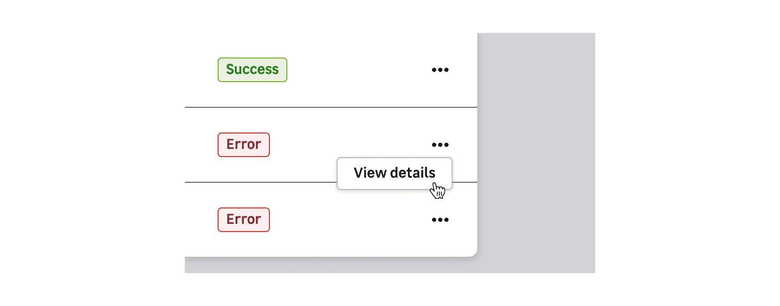
States should be easy to read and defined by a generic word. If you have to give more information, don't hesitate to accompany badges with icon tooltip or trigger a modal with components like a button, link, icon, etc.
Do's and Don'ts
Always use a label in adequation with the state to help the user understand the different types of status.
Never use a badge as a category, it must only be used to display status.
Don't override the colours. They are defined by their status.
Don't use several badges for the same element. It can only have one status.
Never use a badge as a clickable element. A badge should be used to display status information.