Option card
The option card component allows confronting some options of an item (product or service) and can be used to set up or even filter a selection. The content of each option card must be a comparable synthesis to help the user make a choice.
Please, don't confuse the option card with the Card component, which has different usage.
Variations
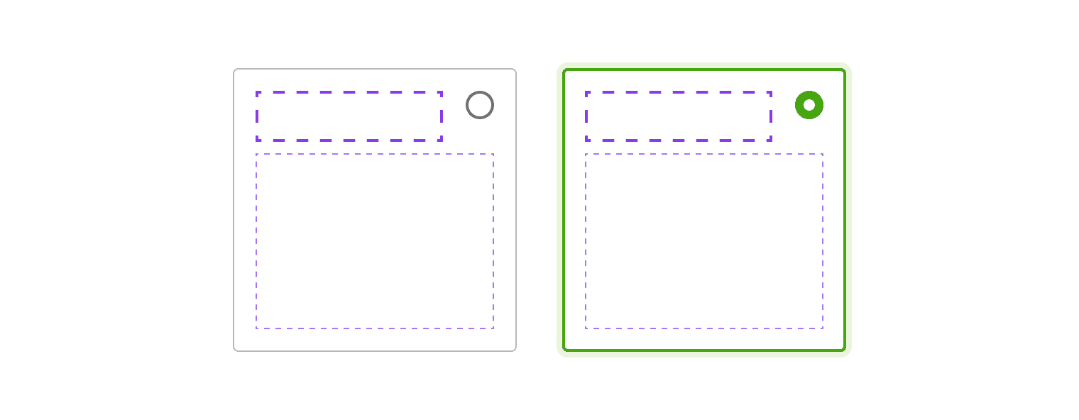
The component provides a default frame and its selected state. Please note that the structure can't be overridable. From an accessible and inclusive way, the option group always contain a checkbox for the multiple choices or a radio button for the single choices.
Single select
Multi-select
Padding
There are two sizes of padding for the option card.
| Size | Value |
|---|---|
| Small | 0.5mu (8px) |
| Medium (default) | 1mu (16px) |
Paddings aren't overridable to keep consistency through products.
Centred version
Depending on your need, radio buttons and checkboxes can be vertically centred.
Behaviours
Text content
The content should be short and readable to help users to compare it quickly and easily.
Interaction
For accessibility reasons, each option card must be fully clickable. Please, don't display secondary actions inside unselected ones.
Specific actions
Depending on the context, a button or a link can appear if the option card is selected.
In case you have to associate a button (or a link) to an unselected option card, it must be displayed outside of the component, for example, below it.
Do's and Don'ts
Never use a button or a link inside an unselected card.