Text area
A text area is used to fill multi-line text. They share appearence and states with text inputs.
Text areas are used for content with multiple sentence like:
- Description
- Review message
- Feedback
- ...
Overview
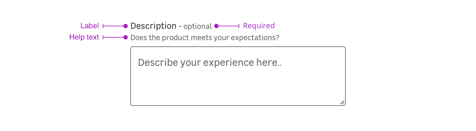
Text areas are a combination of the following mentions. Please note that you can use four different cases:
- Label only + input
- Label + requirement + input
- Label + requirement + help text + input
- Label + help text + input
- Input only
Label
The label helps the user to understand what information is needed in the text area.
Requirement
This mention allows to specify that this information is mandatory for the text area to be valid.
Please note that this mention can also be used to say a specific text area is optional when the other ones are mandatory.
Help text
Help text corresponds to a relevant piece of information to make sure the user understands what is needed.
Input only
In specific use cases, you can use a text area without label.
Do's and Don'ts
Allow users to resize the field height to see more or less the content.
Adapt the textarea width and height depending on the requested content type and length.