Cards
A card is a graphic element that structures a group of related informations that must be understood on its own. It visually looks like a playing card.
Usages
A card is mostly a visualisation of the page that is to come behind the card itself.
Outlined version
Outlined cards are used to avoid floating impressions, for example, when you create parallax or depth effects with different card sizes.
This version is best used when you don't have too many cards to display.
Unboxed version
The unboxed version is best used when you have a large amount of cards to display to avoid graphic complexity due to the repetition of the outline.
Anatomy
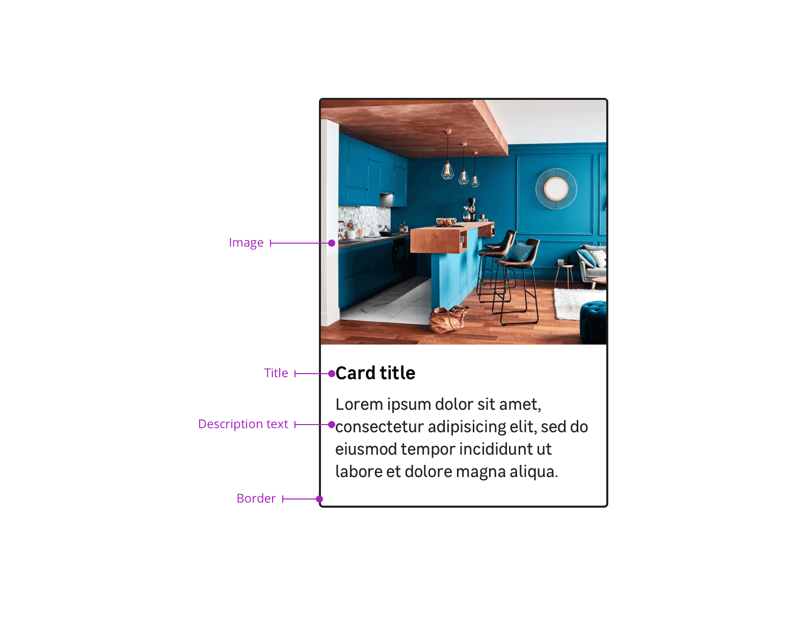
A card must have some distinctive elements to be recognizable and understood on its own:
- an image
- a title
- a subtitle (optional)
- a description text (optional)
- a card footer with actions (optional)
A description text is optional, but it's recommanded to display this element for a better understanding.
Actions
Using an action can facilitate a good comprehension of the most complex cards.
Link
A link is used when the user needs to go on another page.
Button
A button is used when the user can make an action on a card.
Do's and Don'ts
Use cards for grouping similar contents with different destinations.
Don't use cards when users need to compare between multiple options.