Conventions
ITCSS
Introduction
ITCSS stand for Inverted Triangle architecture for CSS, it is a way to better manage specificity and to categorise styles.
- A sane, scalable, managed architecture.
- A school-of-thought, not a library.
- A meta-framework; a framework for frameworks.
The layers are organised in order following those metrics:
- From the generic to the explicit.
- From low specificity to high specificity.
- From global reach to localized reach.
The ITCSS architecture layers
Please note that we use an ITCSS architecture slightly different from the original.
- Settings: Global variables, config switches.
- Tools: Global mixins and functions.
- Generic: Ground-zero styles (Normalize.css, resets, box-sizing).
- Base/Elements: Unclassed HTML elements (tag selectors).
- Layouts: Cosmetic-free design patterns for layout purposes (like grid, or spacing).
- Typography: Base style for text and title
- Components: Designed components, chunks of UI.
- Utilities: Helpers and overrides (mostly single properties classes with !important on them).
Follow ITCSS order for importing your files
Note that all settings and tools are bundled into a file named all-settings.
This file is the only file required by all other files.
This file does not output any CSS when compiled.
/* mandatory */@import '@mozaic-ds/styles/settings-tools/all-settings';/* Generics */@import '@mozaic-ds/styles/generics/g.reset.scss';@import '@mozaic-ds/styles/generics/g.box-sizing.scss';/* Elements */@import '@mozaic-ds/styles/elements/e.inputs.scss';@import '@mozaic-ds/styles/elements/e.headings.scss';@import '@mozaic-ds/styles/elements/e...scss';/* Layouts */@import '@mozaic-ds/styles/layouts/l.grid.scss';@import '@mozaic-ds/styles/layouts/l.flex.scss';@import '@mozaic-ds/styles/layouts/l....scss';/* Components */@import '@mozaic-ds/styles/components/c.buttons.scss';@import '@mozaic-ds/styles/components/c.input-text.scss';@import '@mozaic-ds/styles/components/c....scss';/* Utilities */@import '@mozaic-ds/styles/elements/u.spaces.scss';@import '@mozaic-ds/styles/elements/u.text-align.scss';@import '@mozaic-ds/styles/elements/u....scss';
Naming conventions
Prefixed classes
Following the ITCSS convention, we add two letters in prefix to all our classes.
The first letter of the prefix is the source ID, meaning a letter that tells you that the classes come from our design system. The second letter is the first letter of the ITCSS layer name.
.ml-[classname]: Mozaic layout.mt-[classname]: Mozaic typography.mc-[classname]: Mozaic component.mu-[classname]: Mozaic utility
BEM (Blocks / Elements / Modifiers)
Introduction
BEM was created by Yandex, the "Russian Google" in 2009.
It is a component based architecture and naming convention that stand for Block / Element / Modifier and relies only on classes to create meaningful scalables architectures.
We will explain the basics here, but we recommend developers on learning BEM: read the full documentation.
In the following examples, the prefixes are symbolised by pr in front of the classes.
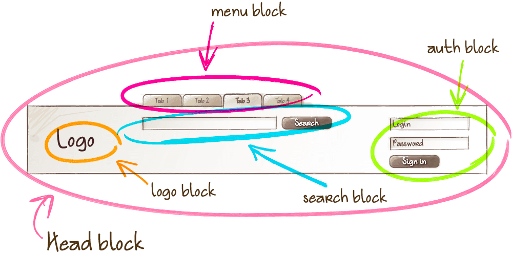
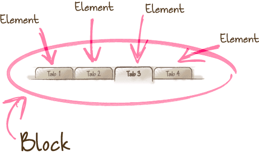
Blocks
You can think of them as components, they are reusable pieces of interface.
css/scss syntax:
.pr-block-name { // ...}
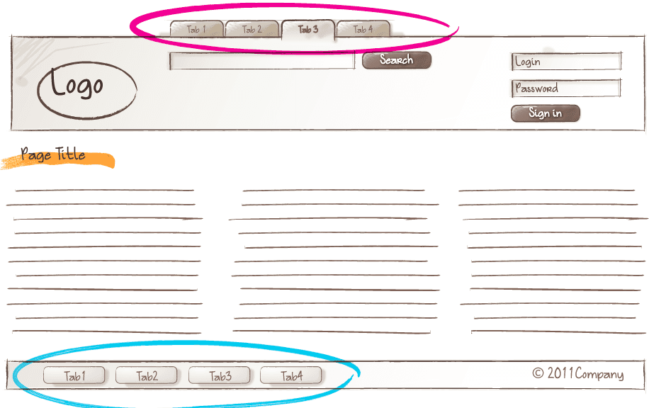
An interface can contain multiple instances of the same block
Elements
A constituent of a block, or children
css/scss syntax:
.pr-block-name__element-name { // ...}
Modifiers
A BEM entity that defines a variation in appearance and behavior of a block or an element.
.pr-block-name--modifier-name { // ...}.pr-block-name__element-name--modifier-name { // ...}
States classes
BEM entities can have states.
States classes starts with an auxilary verb be (or have in fiew cases) like .is-open or .has-no-results
States classes can only be used in combination with another BEM entity:
.mc-accordion.is-open { // ...}.mc-search__results.has-none { // ...}
A state can be defined by the fact that it may change due to user interactions or server response. Modifiers are variations of an element. For example, a button can have modifiers to be a loader button, with a spinning icon .mc-button--loader, but a state in which it is waiting for a server response, like .mc-button--loader.is-loading.
Responsives modifiers
Responsive modifiers are classes that apply their styles only at a certain breakpoint.
They have a suffix @ followed by the name of the viewport they apply to from-xl (example: .mu-hidden@from-m)
To be able to work, the @ character need to be escaped in the css files .mu-hidden\@from-m but can be called without the backslash on the dom : <span class="mu-hidden@from-m"> hide me at M screens </span>
Why BEM?
Just by looking at a piece of markup:
- you can know witch classes are related to others
- you can also know in which file they are defined, reducing headache
- you can understand the role of the classes (And therefore better follow the SRP)
Following these practices will help you:
- take a decision about layout easily
- get self-documented code, and logically reduce the need for CSS documentation
- keep specificity low (because most of your selectors will only be composed of one classes)
- make class collision almost impossible (all classes will be uniques)
- making it safer to have multiple sources of code (any CSS frameworks mixed with our own)
Variables and design tokens
Design tokens are variables that define many properties in a json object that are compiled and exported to multiple formats to be used on web and mobile platforms (or any desired format truly).
For CSS, the tokens are exported as SCSS variables as well as SCSS maps (to give us the ability the map though them).
We use two "layers" of tokens:
1 - the base, low-level layer
To define all the basic values like colors, sizes etc.
As an example, we define all the possible colors in the same place.
Most of the time, you should not have to use those variables directly, because a higher level of a variable or a mixin should be available to provide authorized values for the type of property/element you are trying to define.
2 - an "elements" level layer
For example, we create a list of authorized values for text-colors or create some tokens to define buttons cosmetic styles. This layer makes reference to the base layers values.
In the documentation you may read them expressed as js object keys selectors: color.button.solid.background when compiled to SCSS the dots are replaced with simple dashes - the SCSS variable will be $color-button-solid-background.
Mixins and functions
All mixins and functions used to build all the part of the Mozaic design system CSS are imported into the all-settings sub-bundle.
We take great care to create a lot of mixins to build our CSS framework so that you can mimic the behavior of a classes by applying his properties into another component without the need to import the related SCSS file into your bundle, but also to give you control and extend the existing classes.
There are three types of mixins:
the set-xxx mixins
include properties / values
Example:
.my-class { @include set-font-face('regular');}
Output:
.my-class { font-familly: LeroyMerlin, arial, sans-serif; font-weight: 400;}
the make-xxx mixins
create complete classes
Example:
@include make-flexy-col(1, 2, (s, m));
Output:
.ml-flexy__col--1of2 { flex: 0 0 50%; max-width: 50%;}@media screen and (min-width: 680px) { .ml-flexy__col--1of2\@from-m { flex: 0 0 50%; max-width: 50%; }}
the mod-xxx mixins
that extend existing class with modifiers
Example:
.mu-hidden { @include mod-from-screens(s, m, l) { display: none !important; }}
Output:
.mu-hidden { display: none !important;}@media screen and (min-width: 680px) { .mu-hidden\@from-m { display: none !important; }}@media screen and (min-width: 1024px) { .mu-hidden\@from-l { display: none !important; }}