DataTable
The DataTable efficiently presents large sets of organised data in rows and columns. Its structured format allows for intuitive browsing and analysis of complex information. With built-in paging, sorting, and filtering features, the DataTable is a powerful tool.
Structure
Top bar
The top bar section allows users to edit, filter, set up or do actions.
Each element of the top bar is optional, as is the top bar itself.
Edition
Allow users to interact with selected items.
| Feature | Usage | Note |
|---|---|---|
| Edit selection | Allow to edit data on selected items | Only available when rows are selected |
| Download | Download table or selected rows | |
| Number of selected rows | Display the number of selected rows | Please, read the related documentation for more information |
Styles, labels and icons are not customisable to maintain consistency.
Filter
| Feature | Usage | Preview |
|---|---|---|
| Toggle | Quick filter (max. 1) | |
| Search input | Filter rows with keywords (Please, be explicit for users) | |
| Filter button | Open filters layer |
Active filter
Active filters are displayed between the top bar and the data content to allow users to remove them easier from Removable tags, along with a reset button to remove them all at once. Please allow for an empty state in case no results match the filters.
An empty state must be defined if there are no results.
Settings
Allow users to set up the display of the datatable layout.
| Feature | Usage | Preview |
|---|---|---|
| Settings | Access to table edition like edit columns (reorder, show/hide) or change display density (size of the cells) |
Actions
Actions relate to the data in the table to validate an item or adding a line.
| Feature | Type |
|---|---|
| Validation action | Primary button (solid variation) |
| Rejected/Negative action | Danger button (bordered variation) |
Action buttons can be customised, ensuring compliance with good UX practices and the usages defined in the design system. Using a bottom is recommended for more global actions related to a process or a business gesture.
Data content
Columns
The Datatable allows displaying of several types of data. Only one type of data must be displayed per column to ensure the optimal readability of all the data.
| Data | Usage | Width behaviour |
|---|---|---|
| Text | Display the name, short description of an item | Fixed or fluid |
| Multi-line text | Use to be more explicit and display complementary information of an item | Fixed or fluid |
| Number | Display numeric value. The content is always right justified for better reading | Fixed or fluid |
| Badge | Display the item status | Adapted to the content |
| Input | Allow to edit the content of an item | Fixed or fluid |
| Checkbox | Allow to select an item. Only one column per table, always in first position (on the left) | Fixed |
| Options | Display multiple actions. Only one column per table, always in last position (on the right) | Fixed |
| Icon | Display one specific action | Fixed |
| Link | Allow to access to the dedicated page of an item | Fixed or fluid |
| KPI | Display a progression indicator | Adapted to the content |
| Expand | Display sub-items or details about an item (Only one column per table, always in first position or after the checkbox column) | Fixed |
Rows
In a table, rows correspond to items, while columns list data types for each object, such as status, description, or numeric values. Selecting a row with a checkbox changes its background colour for improved readability.
Sub-rows
Sub-rows provide more details of an item and can't be selected or modified as an object.
Column header
The column header includes:
- A global checkbox for selecting all rows of the current page,
- Capitalized column labels to differentiate them from the data,
- A sorting feature for user assistance.
Depending on the context, the column header can be fixed as well.
Mass selection
Once users have selected all the rows on a page, a dedicated banner for mass selection will appear, allowing them to select all rows in the table, including all pages.
Empty state
An empty state should be defined when no results are found, with a user-friendly message that can be customized to the context, ensuring clarity and avoiding technical language.
Footer
As the number of rows is variable, the DataTable footer is a mandatory element that allows users to manage the navigation and pagination of the table.
| Feature | Usage | Preview |
|---|---|---|
| Row number selector | Allow users to choose the number of row to display | |
| Rows indicator | Indicate the number of rows displayed on the page compared to the total number of rows. | |
| Pagination | Allow users to navigate to the other pages of the datatable |
Variations
Sizes
Cells are available in 3 sizes.
| Size | Value |
|---|---|
| Small | 2.5mu (40px) |
| Medium (default) | 3mu (48px) |
| Large | 3.5mu (56px) |
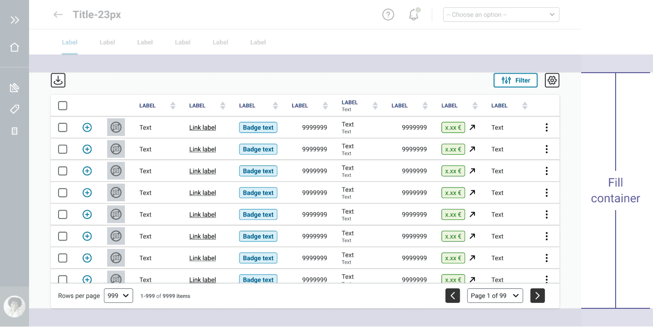
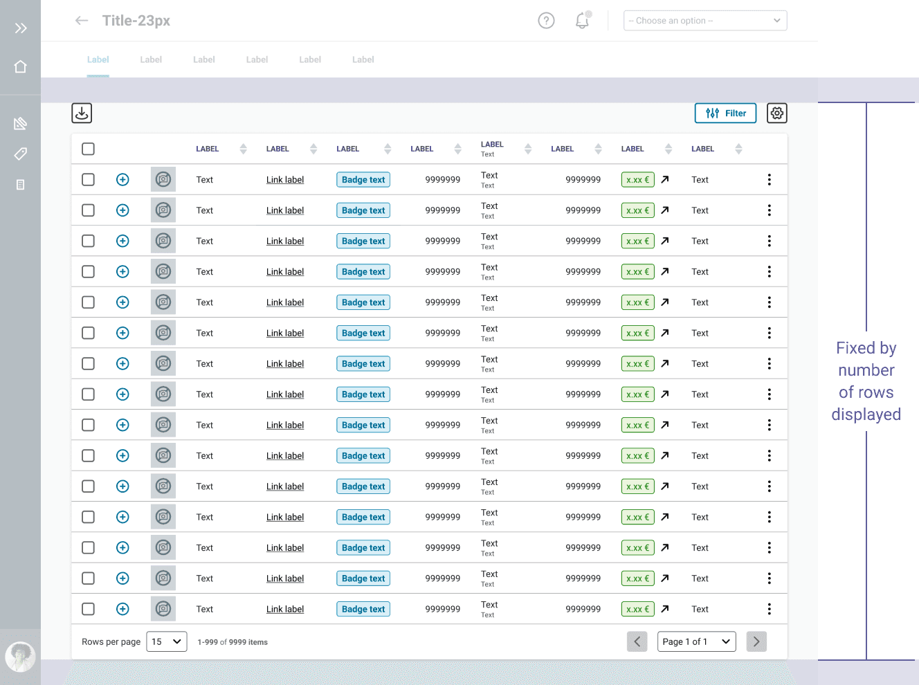
Layout
The data table's height can be defined in two ways to prevent scroll overlap: using the viewport size or specifying the number of displayed rows.
By the size of the viewport
By the number of rows displayed
For the moment, the Datatable component is only available for desktop use.
How to use
We are currently working on the how to use documentation, it will be available soon.
Do's and Dont's
Use capital letters only for the Column header labels, not for data.
Never combine different sizes of cells inside the same datatable.