Tooltip
A tooltip allows you to display further information to the user when needed. It can also be used to explicitely specify a visual element like an icon.
Keep in mind that the current version of the tooltip is not mobile-friendly. Please, prefer its usage on desktop-only products or as an unessential element.
Usage
Please, follow these simple rules when using tooltips:
- A tooltip must be used near the highlighted content
- The tooltip text must be short (1 or 2 lines maximum)
Variations
Text tooltip (default)
The Text tooltip is an additional content used to define an unclear term.
Icon tooltip
This kind of tooltip is displayed when a user needs more information, such as understanding an UI element's purpose. It is usually triggered with an informative icon placed near the UI element.
Specific variation
Without pointer
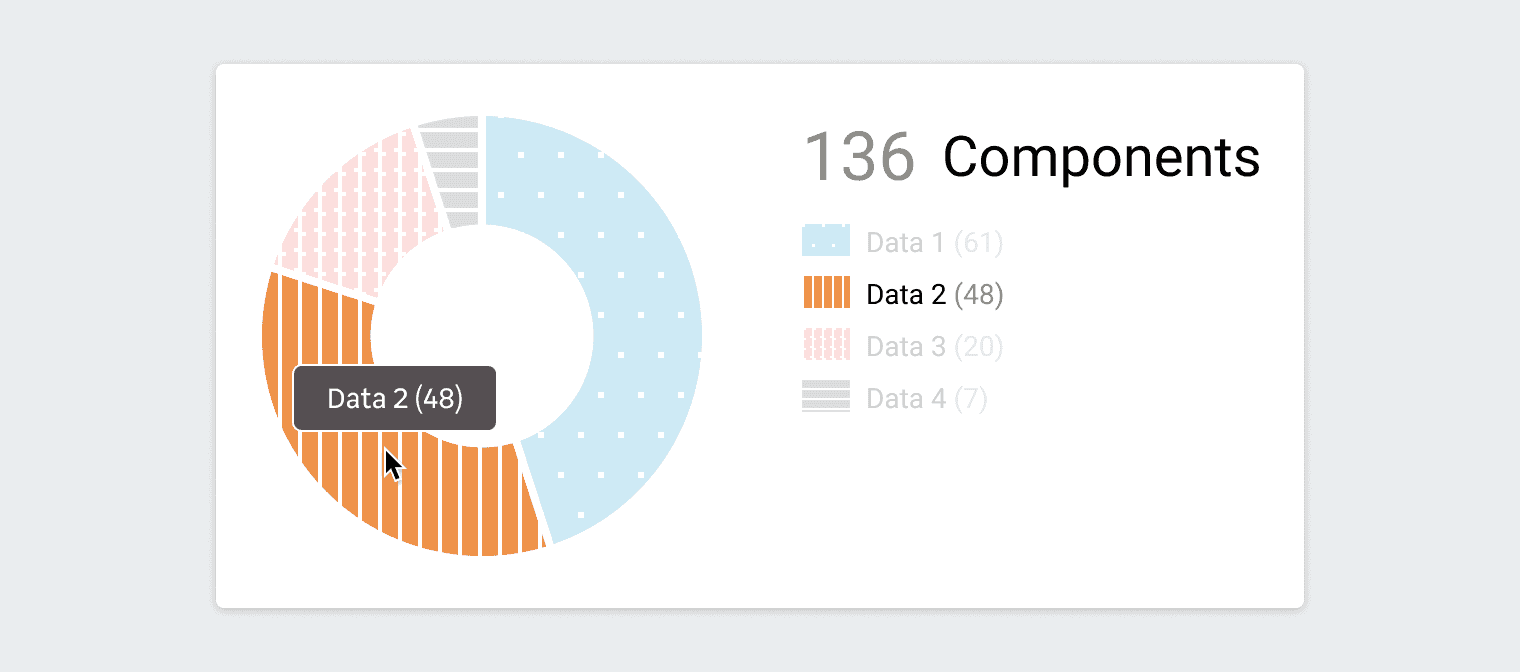
In less common cases, a tooltip should cover a large area and follow the mouse pointer. For example, on Dataviz elements like a slice of a Donut Chart.
Behaviors
Directional
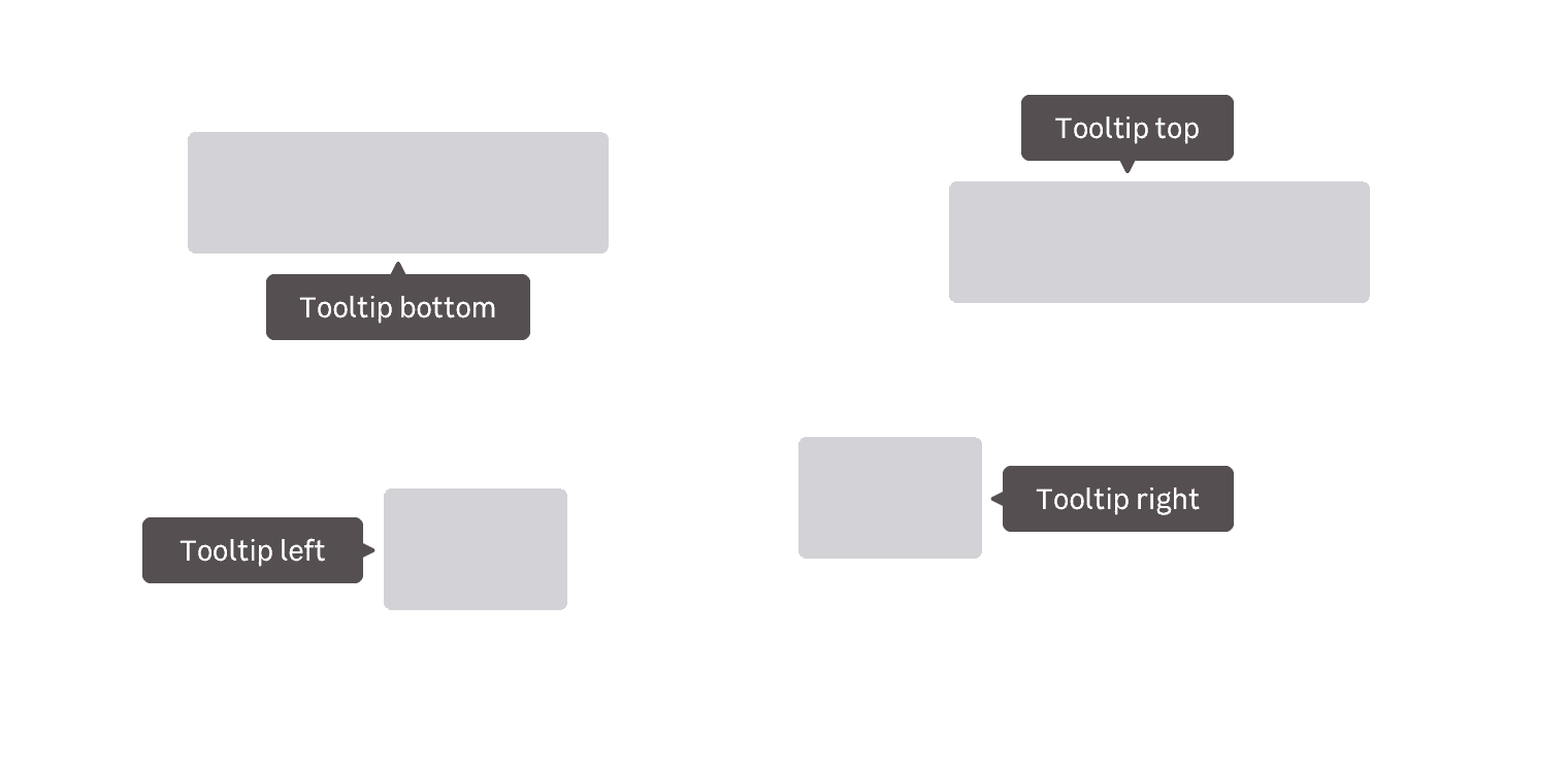
Four tooltip positions are provided to suit your needs at best:
- Left
- Right
- Top
- Bottom
Appearance
Tooltips can appear in several ways depending on the context and the device it is displayed on. You can have tooltips appearing on hover, on focus and on click.
Read more about spacings in this design documentation page
Do's and Don'ts
Never use interactions in tooltips like images, links and buttons in tooltips.