Modals
A modal is a dialog window allowing you to focus the user's attention on a specific task, a piece of information or a mandatory action. It must be used for single action only and must have a call to action button in the bottom.
Modals should be used to:
- Give direct feedback to the user
- Ask for a specific action from the user
- Inform the user about the action that has just been done
Overview
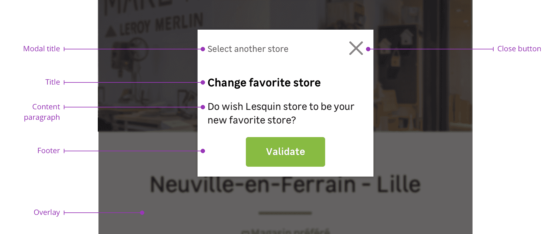
Modals are a combination of the following elements:
- A modal header
- A title
- A content paragraph
- A modal footer with actions
- An overlay
Modal header
The modal header is composed by a modal title that recalls the action clicked by the user and a closing button.
Title (Optional)
The title must be brief and explain the action the user is taking in this dialog. In some cases, you may need to use a modal without a title.
Content paragraph
This is the text where you should inform the user what action is needed with more details.
Modal footer
The footer section is where you will find the call to action button(s). It is a mandatory part in every modal. You will find different variations to suit your needs such as:
- A single call to action button
- A primary call to action button accompanied with a secondary button to give the user an alternative
- A primary call to action button with a link to redirect the user to a page to give more informations
Overlay
Modals must be used with an overlay to focus user's attention on the dialog window.
Behaviours
Height
Please note that every breakpoint has a corresponding maximum height as detailed in this table.
| Breakpoint | Modal max-height |
|---|---|
| S | 100% (16px margin-top and bottom) |
| M | 1:2 screen |
| L | 2:3 screen |
| XL | 2:3 screen |
| XXL | 1:2 screen |
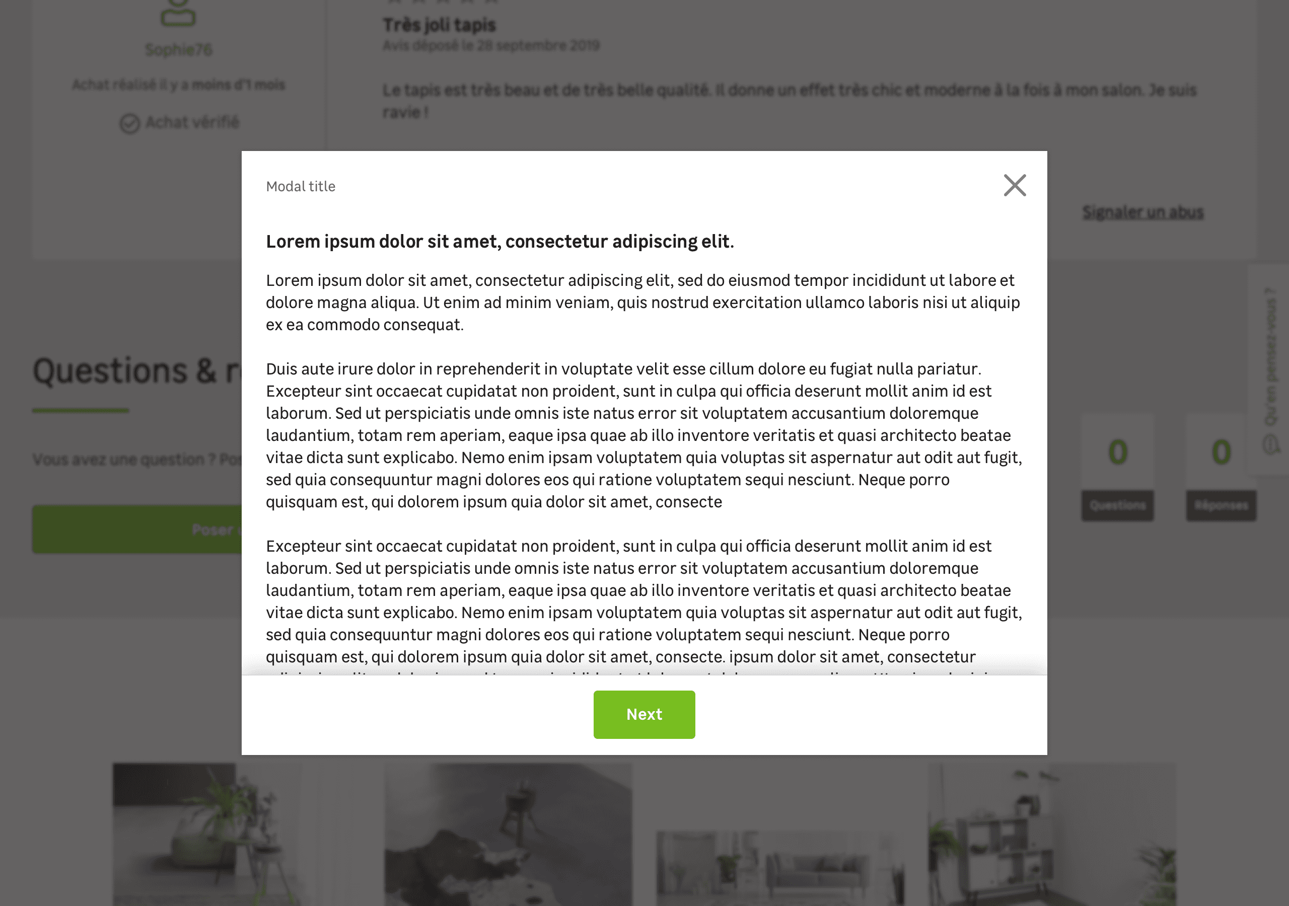
Scroll
In some cases, the content paragraph can be bigger than the modal's viewport. A dropped shadow on the top of the footer is used to indicate to the user that this is a scrollable content.
Specific variation
Delete action
In specific cases, a modal can be used to confirm a destructive action.
Use this variation exclusively for destructive actions. Please use the default variation to notify a user that he'll abort a work in progress.