Toggle
A toggle is used to choose between two possibilities and when the user needs instant feedback. It is common to use toggles when you need to show or hide content and "on/off" switch.
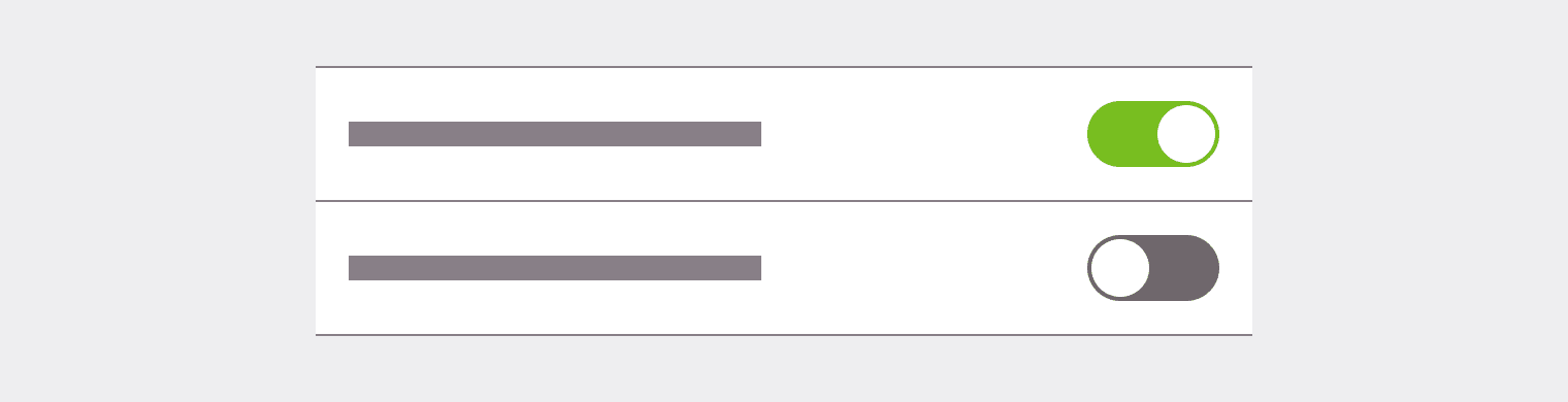
Toggle item
The toggle item is a combinaison of an input and a label.
Toggle group
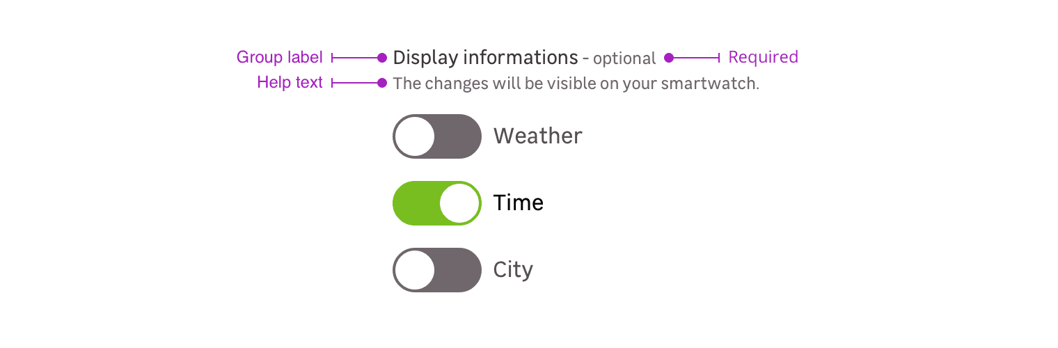
Toggle group is a combination of the following mentions. Please note that you can use five different cases:
- Group label + toggle-s
- Group label + requirement + toggle-s
- Group label + requirement + help text + toggle-s
- Groupe label + help text + toggle-s
Group label
The label group helps the user to understand which toggle to select.
Requirement
This mention allows to specify that this information is mandatory for the input to be valid.
Please note that this mention can also be used to say a specific input is optional when the other ones are mandatory.
Help text
Help text corresponds to a relevant piece of information to make sure the user understands what is needed.
Sizes
Sor small : Used only on desktop when space is a concern.
Mor medium (default): Should be the exclusive size for touch devices, and be used in most of the cases on desktop.
States
Displaying On/Off states in label
You can use a reactive label, witch will change depending on the state of the toggle.
Label on two lines
In uncommon use cases where the text is on two lines, the text box must stay centred with the toggle.
As a reminder, a toggle is used to have instant feedback, using a short label is the best way to use this component.
Specific case
In specific cases, you can use the toggle without its default label.
However, make sure that its use must be relevant and understood by users.
Do's and Don'ts
Toggle should always trigger instantaneous action and feedbacks.
User should never be asked for another validation action.
Use checkboxes instead of toggles if another validation action is to be required from the user.
Never use toggle for multiple choices in a set of related options, use checkboxes instead.
You can find more informations in this medium article.