Icons
Icons must be recognisable at first sight. Here you will find how LEROY MERLIN's icon kit has been made along with some design specificities to help you understand our vision.
Categories
Icons library is divided in twelve categories :
- Navigation
- Product
- Service
- Project
- Media
- Social
- User
- Store
- Device
- Various
- Universe
- Logo
Structure
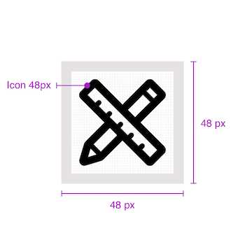
1. Sizes
We have defined 5 sizes for our icons :
- 64px
- 48px
- 32px
- 24px
- 16px
In some very particular cases a 48px can be resized to 40px. 16px icons can only be used for navigation and rating stars.
2. Thickness
LEROY MERLIN's icon are outlined. Thickness is very important in this style and must be followed. Every icon size has its guidelines in terms of thickness. Icon's thickness are divided in two categories : major thickness used to draw the outer shape of the icon and minor thickness to add a second level of details in the icon.

| Size | Major thickness | Minor thickness | |
|---|---|---|---|
| 64px | 3px | 2px | |
| 48px | 3px | 2px | |
| 32px | 2px | 1px | |
| 24px | 2px | 1px | |
| 16px | 2px | 1px |
3. Radius
Radius is only applied to the outside of an outlined path. Rounded shapes don't respond to these following rules.
| Size | Radius |
|---|---|
| 64px | 2px |
| 48px | 2px |
| 32px | 2px |
| 24px | 1px |
| 16px | 1px |
4. Angles
Angles must be 45° multiples.

Here are the possibilities :
- 45°
- 90°
- 135°
- 180°
- 225°
- 270°
- 315°
- 360°
5. Grids
The grid is a marker in the construction of the icon. It results in a consistent icon kit always using the same proportions. The grid allows the designer to design basic shapes on the same principles every time.
A specific grid has been designed for each size. The designed grids are :
- 64px
- 48px
- 32px
- 24px
- 16px
It's important to use the correct size when using an icon in your design. For example, you can't make 200% bigger a 24px icon to have a 48px icon.

5.1 Forms and shapes
The same paddings must be used around the main shape of the icon.

| Icon size | Width | Height |
|---|---|---|
| 64px | 46px | 46px |
| 48px | 34px | 34px |
| 32px | 22px | 22px |
| 24px | 16px | 16px |
| 16px | 10px | 10px |

| Icon size | Width | Height |
|---|---|---|
| 64px | 54px | 54px |
| 48px | 40px | 40px |
| 32px | 26px | 26px |
| 24px | 20px | 20px |
| 16px | 12px | 12px |

| Icon size | Width | Height |
|---|---|---|
| 64px | 27px | 27px |
| 48px | 20px | 20px |
| 32px | 14px | 14px |
| 24px | 10px | 10px |
| 16px | 07px | 07px |

| Icon size | Width | Height |
|---|---|---|
| 64px | 54px | 38px |
| 48px | 40px | 28px |
| 32px | 26px | 18px |
| 24px | 20px | 12px |
| 16px | 12px | 8px |

| Icon size | Width | Height |
|---|---|---|
| 64px | 38px | 54px |
| 48px | 28px | 40px |
| 32px | 18px | 26px |
| 24px | 12px | 20px |
| 16px | 8px | 12px |

| Icon size | Width | Height |
|---|---|---|
| 64px | 54px | 22px |
| 48px | 40px | 16px |
| 32px | 26px | 10px |
| 24px | 20px | 8px |
| 16px | 12px | 6px |

| Icon size | Width | Height |
|---|---|---|
| 64px | 22px | 54px |
| 48px | 16px | 40px |
| 32px | 10px | 26px |
| 24px | 8px | 20px |
| 16px | 6px | 12px |
Spacings

| A | B1 | B2 | B3 | |
|---|---|---|---|---|
| 64px | 5px | 11px | 8px | 4px |
| 48px | 4px | 8px | 6px | 3px |
| 32px | 3px | 5px | 4px | 2px |
| 24px | 2px | 4px | 2px | 2px |
| 16px | 2px | 3px | 1px | 1px |
Best practices
Fixed size vs. variable size
An icon must be used in its original size.
An icon can't be used in another size.

Geometry vs. organic
An icon is based on geometric shapes.

An icon is not supposed to represent reality.

Simple icon vs. complex icon
An icon must be as simple as possible.
An icon shouldn't carry too many details.

Outlined icon vs. filled icon
An icon must be as simple as possible.

An icon in LEROY MERLIN's design can't be filled.

Opacity
An icon uses 100% opacity colors.
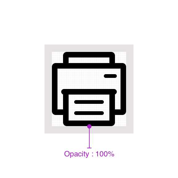
An icon can't use an opacity under 100%.

Single icon vs. drawn over
An icon is unique.

An icon can't be used with another element on top.