Heading
The heading provides basic typographic styles for your page titles, also known as H1. Each heading has its own sizes depending on the breakpoints.
By default the heading is underlined. Depending on the context you can remove the underline to make the heading less attractive.
Read more about the underline.
Default size
Medium Heading
Medium heading is supposed to be used as the default heading style. Every breakpoint has a default value that should be used in most cases.
| Breakpoint | Heading size |
|---|---|
S (320px and up) | 28px (1.75mu) |
M (680px and up) | 34px (2.125mu) |
L to XL (1024px and up) | 41px (2.5625mu) |
Specific sizes
The heading component system still allows you to answer specific needs depending on the content of your pages or your section.
Small Heading
These heading sizes are the smallest sizes you can use for your titles.
If you use smaller values you will loose visual hierarchy with the body.
| Breakpoint | Heading size |
|---|---|
S (320px and up) | 23px (1.75mu) |
M (680px and up) | 28px (1.75mu) |
L to XL (1024px and up) | 34px (2.125mu) |
Large Heading
These heading sizes are the largest sizes you can use for your titles when you need to make some titles stand out, for examples, on pages like landing pages.
| Breakpoint | Heading size |
|---|---|
S (320px and up) | 34px (2.125mu) |
M (680px and up) | 41px (2.5625mu) |
L to XL (1024px and up) | 49px (3.0625mu) |
Variations
Font-weight
There are two different font-weights available for your text headings.
| Font-weight | Usage |
|---|---|
| SemiBold (default) | Mainly used for the page titles to introduce the topic. This font-weight allows giving more emphasis on titles. |
| Regular | Used for the common text headings. Useful when you already use the default heading on the top of the page. |
Text colours
You can use the darkest or the lightest font colour depending on the background colour. This choice must be made with accessibility in mind.
Underlined headings
By default, the heading component is available with underlined text. It allows you to give more importance to your heading or make a visual separation.
Please note that underlined headings are available in SemiBold only.
Underline colours
The colour of the underline allows you to give visual context to your page or section.
| Colour theme | Usage |
|---|---|
| Primary-01-500 | For title pages on light and dark backgrounds |
| Primary-01-200 | For title pages on Primary-01-500 backgrounds |
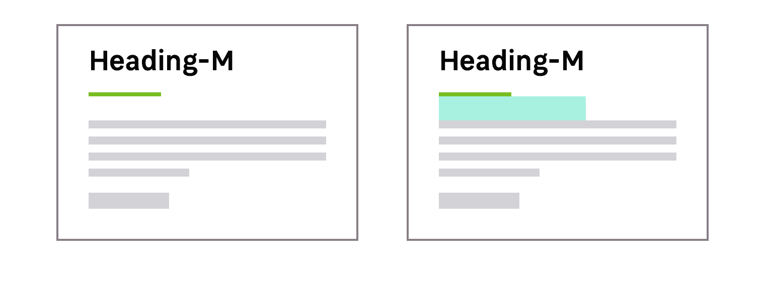
Padding bottom
Headings include a default padding bottom to keep the right vertical rhythm between the interface elements.
Alignment
You can find different aligments, left / center/ right for your headings.
The heading underline will move depending on the alignment you choose to use.
Do's and Don'ts
Don't use a larger size for your text elements than the heading size. It will help you maintain a consistent hierarchy.