Notification
Notifications are used to bring the user's attention on a piece of information that needs to be known. A notification is usually the result of an action made by the user.
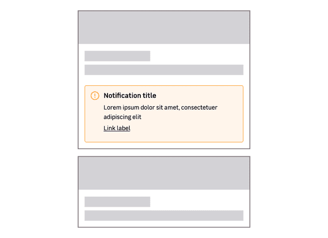
The notification component is made of:
- An icon: In addition to the frame color, it allows to specify the degree of importance.
- A title (optional): Concise and precise, to quickly guide the user.
- A paragraph: To complete the title to be more precise, or indicate the actions to follow.
- One or some actions (optional): A link or button(s) can be used when users need to do an action.
For SEO & accessibility reasons, a paragraph is always required inside a notification.
Types
To learn more about the colors usage, please read the color documentation.
Information
Informational notifications are blue. They are used to highlight a piece of relevant information but don't require immediate action.
Success
Success notifications are green. They are used when an action is successful.
Warning
Warning notifications are orange. They warn the user about important information that deserves caution.
Danger
Danger notifications are red. They are used to warn the user of an error or a problem. This may require immediate action.
Variations
Sizes
Notifications are available in two sizes.
Small
This size is less common and must be used inside a box only. The message or required action must be related to the content of the box.

Medium (default)
This is the default variation to use in most cases and is mainly positioned at the top of a page.
Actions
Link
Use a link when the message indicates an action to do on a different page.
Button
Use a button when the message indicates an action to do immediately.
Closable notifications
In specific cases, you can use a closable notification in your project.
Closable notification can be used with the medium size variation only.
Do's and Don'ts
Always use the type of notification that matches the displayed message.