Radio
A radio button is used to offer a unique choice to your user in a form. Unlike checkboxes, it can not be used alone.
Overview
A radio button can't be used alone, it must be used within a group.
Radio button group is a combination of the following mentions. Please note that you can use four different cases:
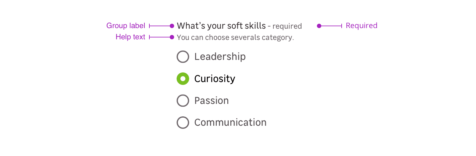
- Group label + radio buttons
- Group label + requirement + radio buttons
- Group label + requirement + help text + radio buttons
- Groupe label + help text + radio buttons
Label group
The label group helps the user to understand which radio to check.
Requirement
This mention allows to specify that this information is mandatory for the input to be valid.
Please note that this mention can also be used to say a specific input is optional when the other ones are mandatory.
Help text
Help text corresponds to a relevant piece of information to make sure the user understands what is needed.
Note that the elements become horizontally aligned from the
m-mediumbreakpoint (768px). Below this resolution, the elements are arranged vertically.
Validation
There are two different elements for validation feedback:
- The color of the input outline.
- A text under the radio button group explains what's wrong with the data entered.
Do's and Don'ts
Use short radio list. User should be able to scan quickly between few option. If you have a lot of option, prefer a drop down list.
Never use the radio alone. You should always use it with a label and within a group.