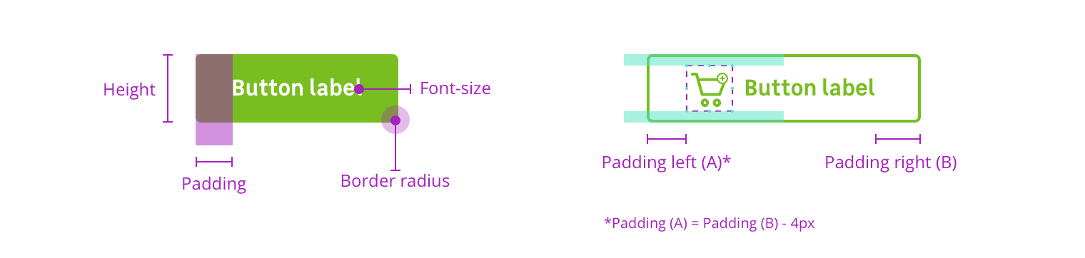
Anatomy
Properties
Layout / sizes
| Size name | Height | Paddings | Font-size | radius |
|---|
| Small | 32px (2mu) | 16px (1mu) | size.font.04 (14px) | radius.m (4px) |
| Medium (Default size) | 48px (3mu) | 32px (2mu) | size.font.05 (16px) | radius.m (4px) |
| Large | 56px (3.5mu) | 40px (2.5mu) | size.font.06 (18px) | radius.m (4px) |
Icon / sizes
| Size name | Width and height |
|---|
| S | 16px (1mu) |
| M | 24px (1.5mu) |
| L | 32px (2mu) |
Color themes
Available themes are :
solidsolid-neutralsolid-primary-02solid-dangerborderedbordered-neutralbordered-primary-02bordered-danger
buttons states colors are defnied for each theme :
| State | Property | Token |
|---|
| Default | background-color | color.button.[theme].background |
| Default | color | color.button.[theme].font |
| Default | border-color | color.button.[theme].border |
| Hover | background-color | color.button.[theme].hover.background |
| Hover | color | color.button.[theme].hover.font |
| Focus | border-color | color.button.[theme].focus.border |
| Active | background-color | color.button.[theme].active.background |
| Disabled | background-color | color.button.[theme].disabled.background |
| Disabled | color | color.button.[theme].disabled.font |