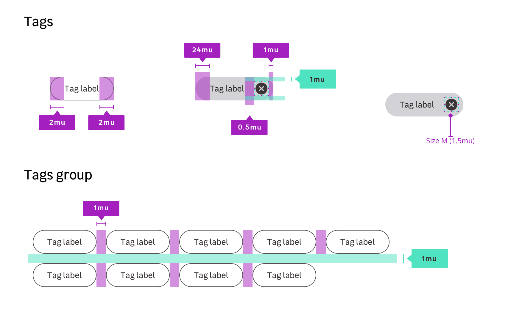
Tags
Anatomy
Properties
Layout / sizes
| Size name | Paddings | Font-size | radius |
|---|---|---|---|
| Small | 4px 16px $mu025 $mu100 | size.font.04 (14px) | 0.75rem |
| Medium (Default size) | 8px 16px $mu050 $mu100 | size.font.04 (14px) | 1rem |
Colors
Text tag
| theme | Property | Token | value |
|---|---|---|---|
| light | background-color | color.tag.text.light.background | #ffffff |
| light | border-color | color.tag.text.light.border | #554f52 |
| light | text color | color.tag.text.light.text | #554f52 |
| dark | background-color | color.tag.text.dark.background | #000000 |
| dark | border-color | color.tag.text.dark.border | #ffffff |
| dark | text color | color.tag.text.dark.text | #ffffff |
Link tag
| theme | state | Property | Token | value |
|---|---|---|---|---|
| light | default | background-color | color.tag.selectable.light.background | #ffffff |
| light | default | border-color | color.tag.link.light.border | #554f52 |
| light | default | text color | color.tag.link.light.text | #554f52 |
| light | hover | background-color | color.tag.link.light.hover.background | #eeeef0 |
| light | active | background-color | color.tag.link.light.active.background | #d3d2d6 |
| dark | default | background-color | color.tag.link.dark.background | #000000 |
| dark | default | border-color | color.tag.link.dark.border | #ffffff |
| dark | default | text color | color.tag.link.dark.text | #ffffff |
| dark | hover | background-color | color.tag.link.dark.hover.background | #3c3738 |
| dark | active | background-color | color.tag.link.dark.active.background | #554f52 |
Selectable tag
| theme | state | Property | Token | value |
|---|---|---|---|---|
| light | default | background-color | color.tag.selectable.light.background | #d3d2d6 |
| light | default | text color | color.tag.selectable.light.text | #222020 |
| light | hover | background-color | color.tag.selectable.light.hover.background | #add585 |
| light | active | background-color | color.tag.selectable.light.active.background | #41a017 |
| light | disabled | background-color | color.tag.selectable.light.disabled.background | #eeeef0 |
| light | disabled | text color | color.tag.selectable.light.disabled.text | #887f87 |
| light | selected | background-color | color.tag.selectable.light.selected.background | #78be20 |
| dark | default | background-color | color.tag.selectable.dark.background | #3c3738 |
| dark | default | text color | color.tag.selectable.dark.text | #ffffff |
| dark | hover | background-color | color.tag.selectable.dark.hover.background | #78be20 |
| dark | active | background-color | color.tag.selectable.dark.active.background | #0a601b |
| dark | disabled | background-color | color.tag.selectable.dark.disabled.background | #554f52 |
| dark | disabled | text color | color.tag.selectable.dark.disabled.text | #887f87 |
| dark | selected | background-color | color.tag.selectable.dark.selected.background | #158110 |
Removable tag
| theme | state | Property | Token | value |
|---|---|---|---|---|
| light | default | background-color | color.tag.removable.light.background | #d3d2d6 |
| light | default | text color | color.tag.removable.light.text | #222020 |
| light | default | icon color | color.tag.removable.light.icon | #3c3738 |
| light | hover | background-color | color.tag.removable.light.hover.background | #bab6bc |
| light | active | background-color | color.tag.removable.light.active.background | #a19ba2 |
| dark | default | background-color | color.tag.removable.dark.background | #3c3738 |
| dark | default | text color | color.tag.removable.dark.text | #ffffff |
| dark | default | icon color | color.tag.removable.dark.icon | #d3d2d6 |
| dark | hover | background-color | color.tag.removable.dark.hover.background | #554f52 |
| dark | active | background-color | color.tag.removable.dark.active.background | #6f676c |